Wren Hall Nursing Home Branding
Client: Wren Hall Nursing Home
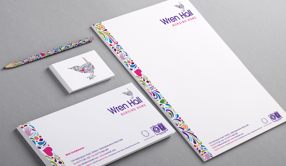
Wren Hall is an award winning, specialist Dementia care nursing home, situated in the Nottinghamshire village of Selston. They commissioned Inchpunch to design a vibrant new logo that would reflect their values and visually set them apart from the competition.
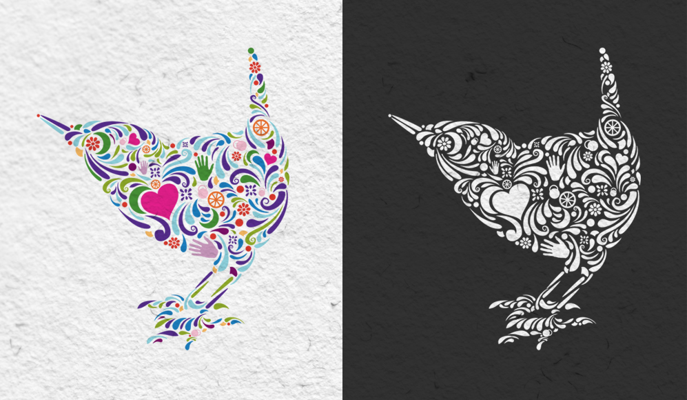
Whilst discussing the project with Wren Hall's owner Anita Astle, she showed us a series of icons (heart, hand, wheel, flower etc) that related directly to the the different facets of Dementia. Understanding the importance and relevance of these symbols became fundamental in the creation of the logo.
We decided an illustrative approach to the identity would be the most appropriate direction, as this organic style really conveys a sense of freedom and choice, values which Wren Hall were keen to promote. The intricately drawn elements that make up the wren shape incorporate the Dementia symbols in prominent positions. The vivid colour palette brings the whole logo to life and conveys the friendly and welcoming environment of Wren Hall.
We decided an illustrative approach to the identity would be the most appropriate direction, as this organic style really conveys a sense of freedom and choice, values which Wren Hall were keen to promote. The intricately drawn elements that make up the wren shape incorporate the Dementia symbols in prominent positions. The vivid colour palette brings the whole logo to life and conveys the friendly and welcoming environment of Wren Hall.
Wren Hall Signage
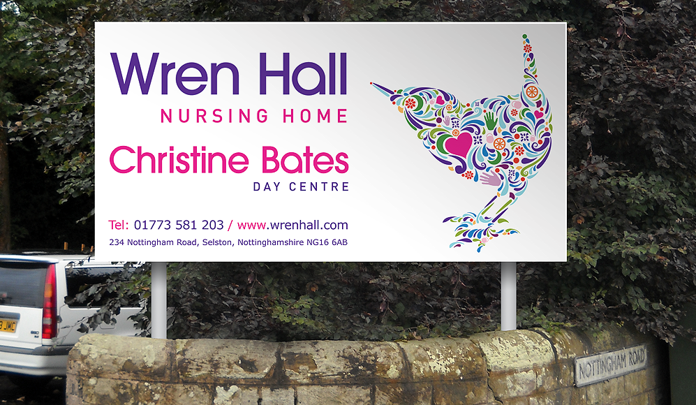
The entrance to Wren Hall is situated on the main road through Selston which can become very busy at peak times of the day. New visitors had often complained that the previous sign was not prominent enough to be seen easily when travelling on the main road. We took this feedback onboard and made sure our sign was large enough and post mounted at a good height to be seen when driving at speed. We also mounted the sign on an angle so it could be clearly seen by approaching traffic and the junction opposite. The prominent use of white ensured the sign is highly visible against the backdrop of trees. The distinctive eye catching wren logo also helped visitors identify the location.
This 1000 x 2000mm sign was constructed from a 3mm thick folded aluminium tray, powder coated white with vinyl lettering and graphics applied.
|
|
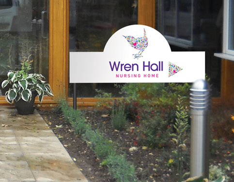
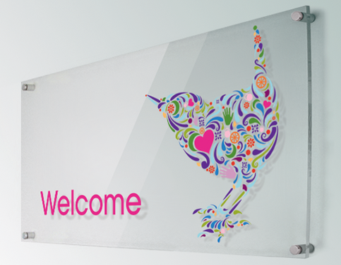
We also produced several smaller signs around Wren Hall including all the directional signage and main reception area "welcome" sign. The stylish and contemporary welcome sign was created by applying vinyl cut out graphics to a large 8mm thick acrylic panel. The panel was then mounted to the wall via four polished aluminium barrel mounts.
Wren Hall Marketing Material
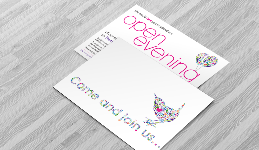
As part of the brand development we produced a series of printed literature including leaflets, posters and brochures. To give this literature its own identifiable "Wren Hall" style, we reused the organic shapes from the wren logo to create visual key statements and illustrations.
As part of the brand development we produced a series of printed literature including leaflets, posters and brochures. To give this literature its own identifiable "Wren Hall" style, we reused the organic shapes from the wren logo to create visual key statements and illustrations.
Wren Hall Website and Corporate Video
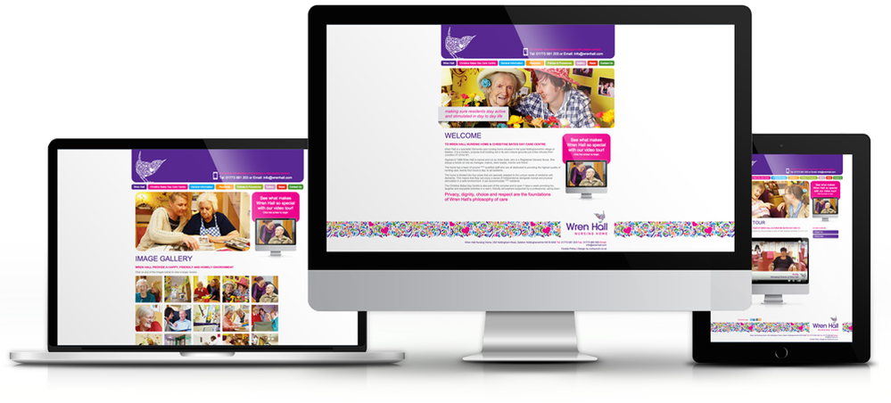
The Wren Hall Nursing Home website is an engaging, informative and uplifting experience for its readers. The colourful design is consistent with the new branding and the content covers all aspects of Wren Hall including accommodation, activities, fees, contact with family, medication etc.
Throughout the website there are lots of genuine resident and staff photographs taken on-site. All the images are very positive and reflect the caring atmosphere enjoyed by all at Wren Hall. The dedicated Gallery page shows many residents happily engaged in social activities.
To really communicate the "Wren Hall experience" we produced a short documentary to feature on the website. The film really captures the positive and caring community spirit of Wren Hall, something pictures and words simply cannot convey. An interview with the Wren Hall owner Anita opens the video and it then showcases all aspects of the facility including resident / family testimonials, Christine Bates Day Care Centre and accommodation.