"SORTED" Recycling Campaign
Client: Selby District Council
To help improve the recycling of household waste throughout the area, Selby District Council wanted to introduce two new wheelie bins to replace the existing smaller boxes. The new blue (glass, cans & plastic) and brown (paper & cardboard) wheelie bins allow residents to recycle more. To accommodate the additional workload, a new collection schedule would also have to be introduced at the same time.
To help embed these important changes into resident's weekly routines, it was decided the campaign needed its own name, identity and suite of marketing material.
To help embed these important changes into resident's weekly routines, it was decided the campaign needed its own name, identity and suite of marketing material.
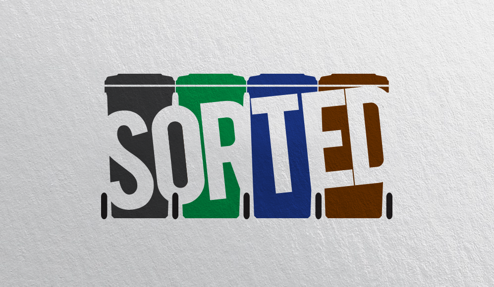
With the aid of the Council's own focus group, the campaign was named "SORTED" and the immediate requirement was the campaign logo so it could be shared with residents through social media channels. In response, we created a bold logo that is visually easy to understand. The colours are representative of the two existing bins already in circulation (black & green) plus the two new ones (blue & brown).
Facebook Posts
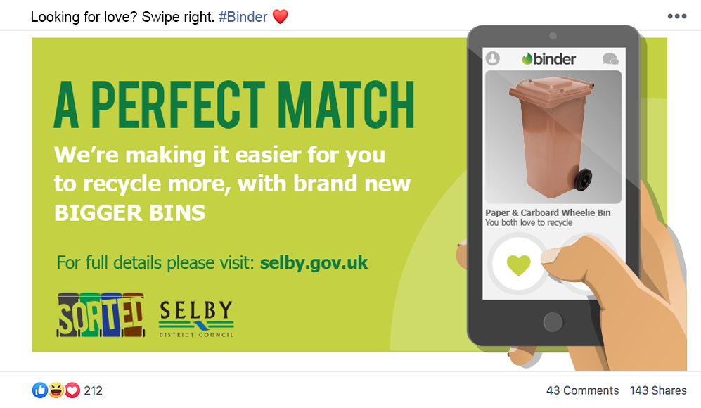
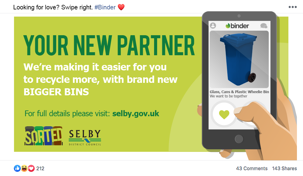
Facebook proved to be the perfect place to start the campaign, introducing the new logo and branding to residents. As the launch date was February 14th, we wanted to have a connection with Valentine's Day. We opted for a humorous / quirky approach in the form of "Binder", a parody on the popular Tinder app.
Residents Information Pack
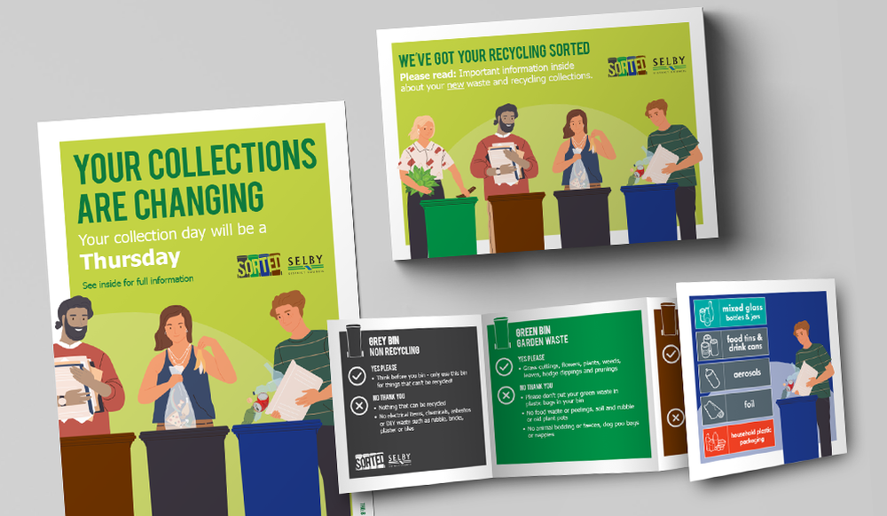
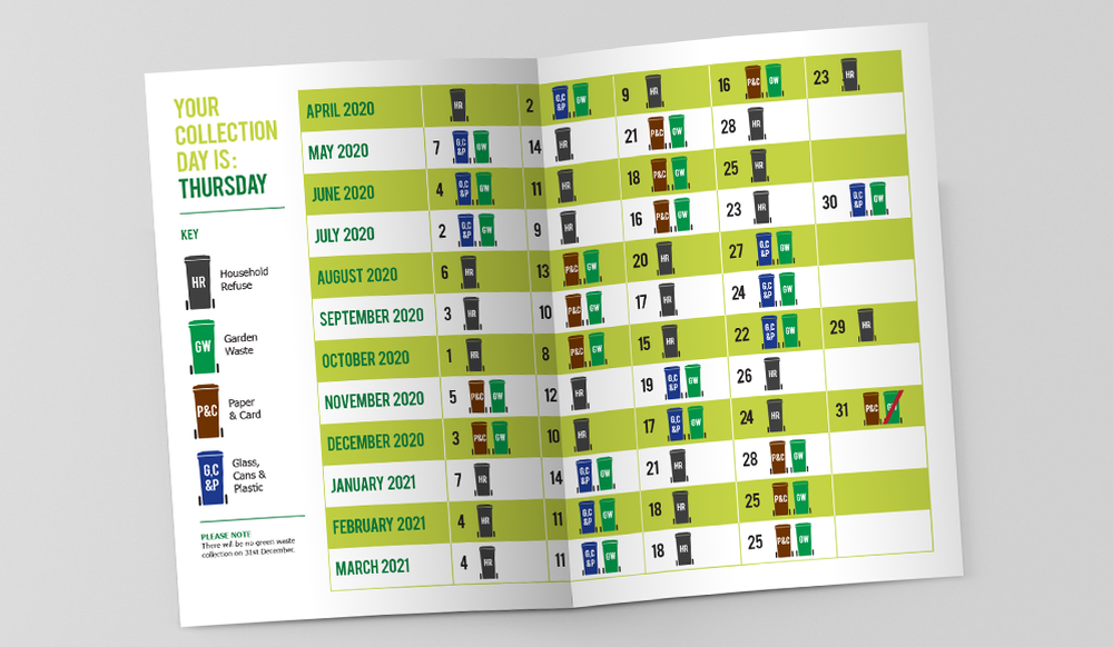
Every home in the Selby District received an information pack through their letterbox. Within the branded C5 envelope their is an A5 leaflet explaining the forthcoming changes, a new collections timetable clearly showing which coloured bin/s should be left out on specific dates and a Z Fold leaflet highlighting which items are (or aren't) acceptable in each of the wheelie bins.
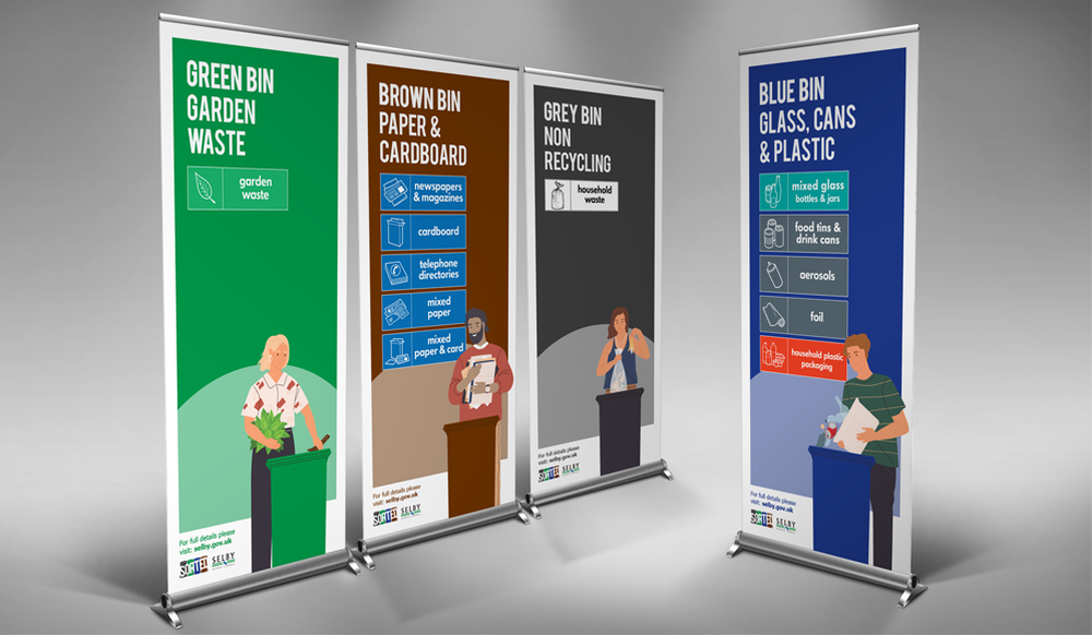
Just like the SORTED logo, we created the marketing material with the same "easy to understand" approach. The large heading delivers the main message with the illustration (four people recycling a variety of household waste into the new, larger wheelie bins) reinforcing it.
Just like the SORTED logo, we created the marketing material with the same "easy to understand" approach. The large heading delivers the main message with the illustration (four people recycling a variety of household waste into the new, larger wheelie bins) reinforcing it.
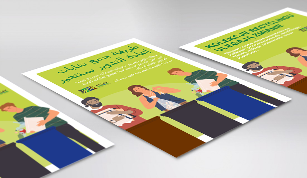
The literature was also translated into the district's top three most commonly spoken non-English languages; Hungarian, Arabic and Polish.
Pull Up Banner Stands
