Pink Sun Product Packaging Design
Client: Pink Sun Limited
Pink Sun provide a range of top quality organic, gluten free, sugar free, nutritious and wholesome foods and food supplements.
When organic whole food supplier Pink Sun decided they wanted a fresh new look for their packaging, they selected Inchpunch Design to deliver the creative goods. The main trigger for the packaging rebrand was the company's decision to shift from on-line only sales and venture into the highly competitive retail environment.
To ensure Pink Sun could compete with the much bigger and more established health food brands we integrated the following marketing requirements into the design process:
• Create a recognisable package design that will be consistent across the entire product range
• Ensure it is visually different to the competition and has its own unique "shelf presence"
• The overall design must reflect the quality of its contents
• Include prominent Pink Sun logo placement
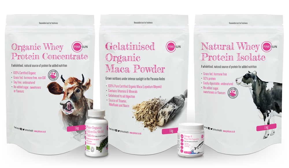
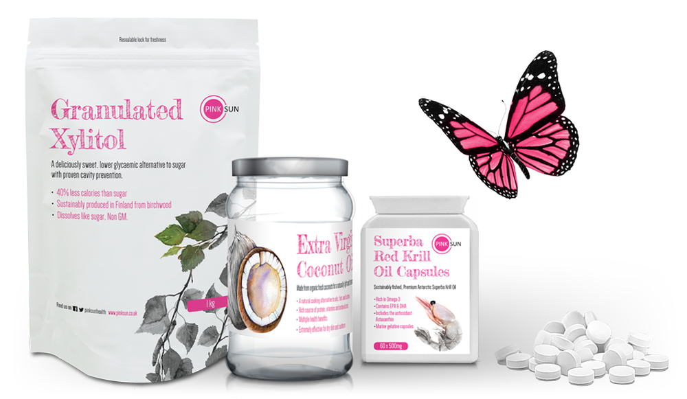
Our new packaging has a very distinctive look which is achieved through a combination of a minimalist layout, limited pink / black / white colour palette, unique hand written product titles and watercolour style illustrations. The minimal approach reflects the product contents which remain as natural as possible (no additional ingredients). The free hand font and painted illustrations give the packaging an artisan style country feel.
To ensure Pink Sun could compete with the much bigger and more established health food brands we integrated the following marketing requirements into the design process:
• Create a recognisable package design that will be consistent across the entire product range
• Ensure it is visually different to the competition and has its own unique "shelf presence"
• The overall design must reflect the quality of its contents
• Include prominent Pink Sun logo placement
Our new packaging has a very distinctive look which is achieved through a combination of a minimalist layout, limited pink / black / white colour palette, unique hand written product titles and watercolour style illustrations. The minimal approach reflects the product contents which remain as natural as possible (no additional ingredients). The free hand font and painted illustrations give the packaging an artisan style country feel.