NYBEP Logo, Branding, Promotional Material & Website Design
Client: NYBEP Ltd.
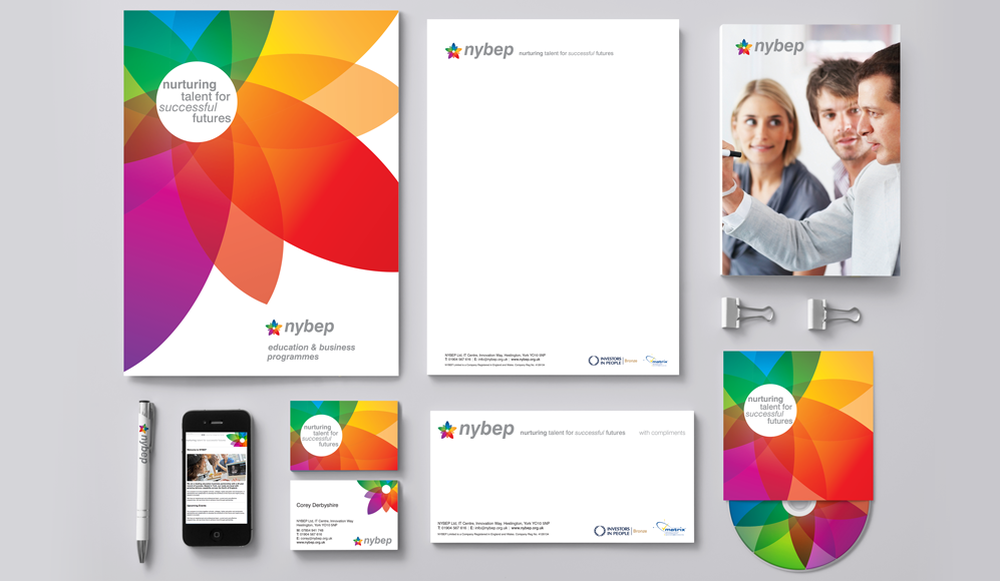
NYBEP (North Yorkshire Business Education Partnership) is an accredited provider of business education services. They bring together schools, colleges, higher education and business, working regionally and nationally.
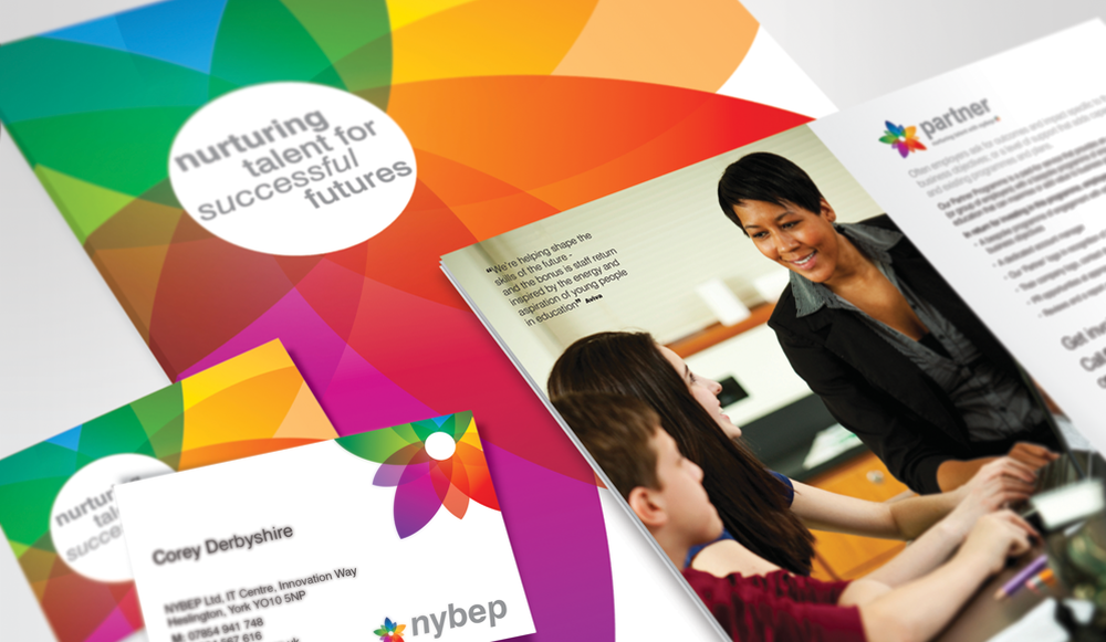
To expand their market reach and attract new customers NYBEP decided their flagship Education and Business Programmes required a bold new identity that would convey the company's vision 'nurturing talent for successful futures' and visually engage with both the education and business sectors.
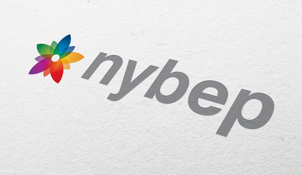
To achieve this we created a vibrant flower graphic which symbolises 'talent' and just like a real flower, talent needs supportive 'nurturing' in order for it to grow and flourish.
To achieve this we created a vibrant flower graphic which symbolises 'talent' and just like a real flower, talent needs supportive 'nurturing' in order for it to grow and flourish.
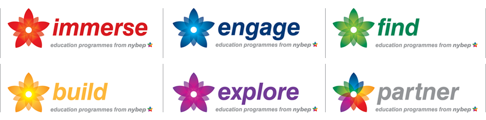
Each Education Programme has its own individual accent colour which is used to visually differentiate itself when required. All the colours combine to form the main NYBEP and Partner logo branding. The Partner logo is used by businesses that support NYBEP on their promotional literature like a kite mark.
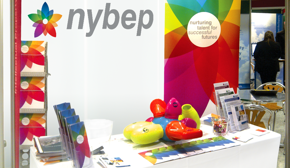
NYBEP Exhibition Design
With such a small area to work with, it was paramount that we maximised the visual impact of the display. The white back drop and table covering enabled the vivid colours of the new corporate literature to really stand out. The exhibition space created a modern, fresh and friendly feel that visitors found interesting, engaging and very approachable.
With such a small area to work with, it was paramount that we maximised the visual impact of the display. The white back drop and table covering enabled the vivid colours of the new corporate literature to really stand out. The exhibition space created a modern, fresh and friendly feel that visitors found interesting, engaging and very approachable.