
Hunmanby Tourist Information Board
Client: Hunmanby parish Council
The Innovate York programme is a partnership between Science City York and the City of York Council that aims to accelerate innovation in York through a collaborative series of projects and events.
Inchpunch Design was hired to create the new logo and develop the branding. To help us fully understand the clients marketing aims we hosted an on-site "branding session" with the marketing team. This informal and free flow exchange of ideas helped define the following goals:
• Create a contemporary yet friendly looking logo that encapsulates the "adaptive" nature of the programme
• Ensure it visually engages with the business community, residents and the wider city
• The logo must be versatile enough to use across all forms of printed and digital communication
During the meeting the "chameleon" concept was pitched and discussed. Visually it could effectively convey the adaptive nature of the programme offering. This was received positively by the team and gave the logotype development a direction.
The final logo design combines clean modern typography with a stylised illustrated chameleon. The chameleon is separated into three sections with the body encompassing a spectrum of liquid colours. This represents all those innovative thoughts and ideas that have yet to be realised. Note how the chameleon head and tail sections are the same colour as the typography which helps link all the graphic elements together.
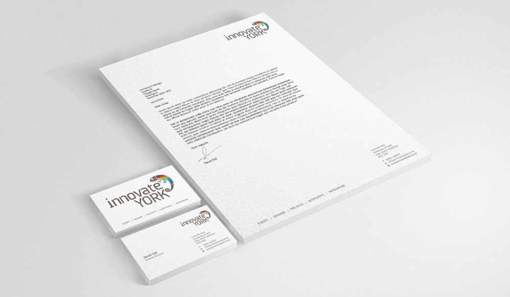
To deliver the adaptive nature of the programme the logo can be customised to display an image that reflects individual partner projects. The standardised elements ensure the logo remains consistent despite the customisation. All correspondence between the partnership and the client will feature this unique branding creating a real sense of collaboration and identity.
We are really pleased with the new logo and especially impressed with the creative thought process behind its creation. It cleverly combines the adaptive and innovative approach of our programme.
All content ©Inchpunch Design Limited.