Friendly Branding, Packaging & Exhibition Display
Client: Friendship Estates Ltd.
Friendship Estates Ltd is a family run farming and feed manufacturing business based near Doncaster, South Yorkshire. When the decision was made to rebrand their best selling "Small Pet Products" range they contacted Inchpunch for creative assistance.
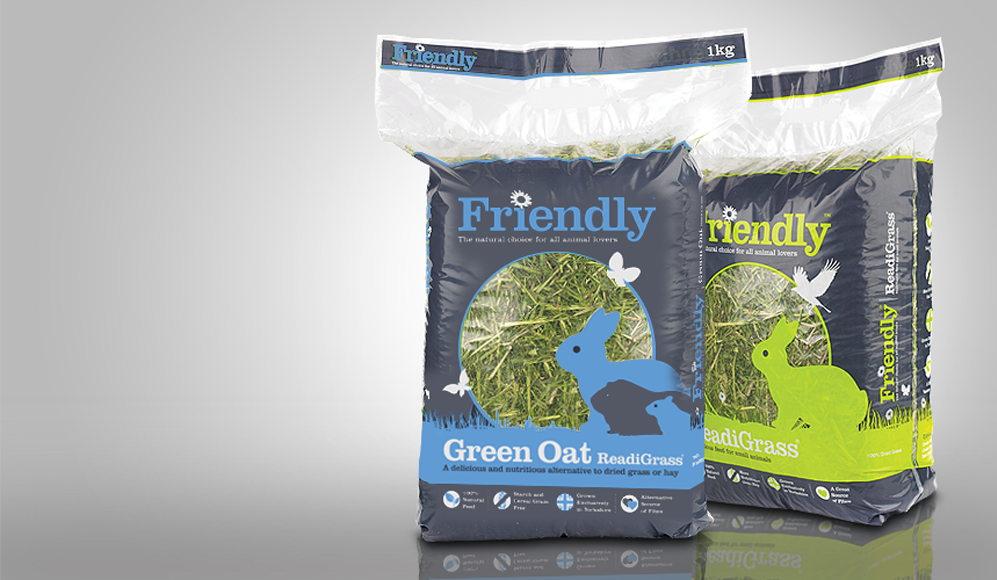
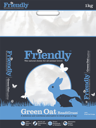
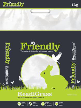
Our first task was to completely re-design the packaging for the Friendly Small Pet product range. This range currently consists of four different products (three of which are shown below) but more will be added in the future. Working closely with Friendship, we helped them identify what they wanted to achieve with the new packaging and who they wanted it to appeal to. Armed with this information we prepared an initial brief that included the following packaging design prerequisites:
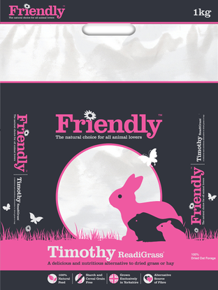
• Include a large transparent area so the product within can be clearly seen
• Ensure the product name and purpose is obvious (on all four sides)
• Make the packaging look appealing, professional and eye catching
• Highlight the product key benefits
• The overall design must retain visual consistency across all products but be clearly different
|
|
|
The product itself is the primary selling point as it looks much more appetising than many of its competitors. To maximise this, a large clear circular area was integrated into the design, making the product a prominent feature.
To create a strong visual style we used illustrative animal silhouettes (rather than photographs) and limited the colour palette to just three colours. The white and grey remained consistent throughout with only the main accent colour changing on each product.
To highlight the key product benefits we created a series of simple but effective icons. Using minimal text the icons can be quickly and easily interpreted.
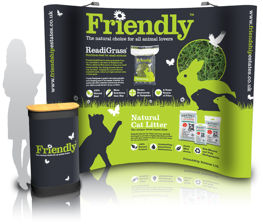
Friendly Exhibition Display Stand
To promote the new look Friendly brand at a recent trade event, we designed the pop up exhibition banner graphic and lectern wrap. A strong visual link to the product packaging was implemented and the clear messaging reinforced.
To promote the new look Friendly brand at a recent trade event, we designed the pop up exhibition banner graphic and lectern wrap. A strong visual link to the product packaging was implemented and the clear messaging reinforced.