Earley Ornamentals Newsletter
Client: Earley Ornamentals Ltd.
Earley Ornamentals is one of the UK's leading independent producer and supplier of young plants. Over 180m plants, made up of over 1,700 varieties, are grown each year at their state-of-the-art 12 acre site near Thirsk, North Yorkshire.
As part of their on-going marketing campaign, Earley Ornamentals wanted to introduce a printed newsletter that they could distribute to existing and new customers. It's purpose is to engage with the customer and inform them of new plant ranges, colour trends, innovations etc. Earley's appointed marketing company (CR Marketing) hired Inchpunch to bring this project to life.
After discussions with the client and marketing team regarding the ideal look of the new publication, we established that it needed to be colourful but clean, incorporate a structured page layout and convey a contemporary style. All these elements were factored in to our design solution.
After discussions with the client and marketing team regarding the ideal look of the new publication, we established that it needed to be colourful but clean, incorporate a structured page layout and convey a contemporary style. All these elements were factored in to our design solution.
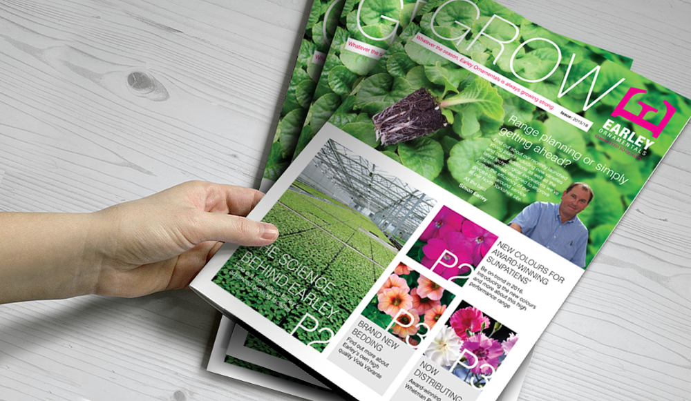
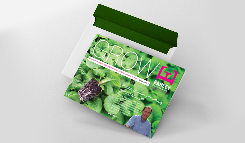
On the front cover we were keen to include a prominent forward section from owner Simon Earley. Earley Ornamentals is a family run business and we wanted to give the company a human face. His forward is also an opportunity to highlight interesting company information and any special promotions.
We visually split the front cover layout into two separate sections so the A4 portrait publication can be folded in half (A5 landscape) and both sides can be read independently. This practical and innovative design feature reduced postage costs when it came to distribution.
We visually split the front cover layout into two separate sections so the A4 portrait publication can be folded in half (A5 landscape) and both sides can be read independently. This practical and innovative design feature reduced postage costs when it came to distribution.
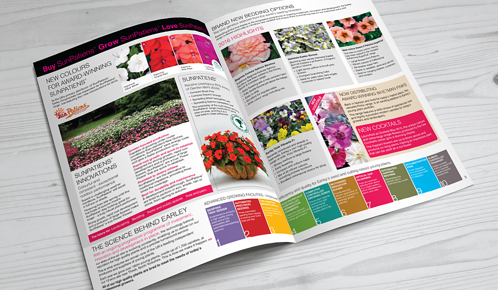
Using bold block colour, vivid product images and clever typography, the inside double page spread continues the colourful but clean look of the front cover. All the featured articles are clearly sectioned and easy to read. Though the newsletter primary purpose is to sell, it has more of a "lifestyle" quality that readers will really engage with.
The way Inchpunch handled this design project was very impressive. They took on board all our comments then went away and came back with a concept that exceeded all our expectations. They even came up with the publication name "Grow"! Nothing seemed like too much trouble and Siobhan was an absolute pleasure to work with.
All content ©Inchpunch Design Limited.