Earley Ornamentals Marketing Material
Client: Earley Ornamentals Ltd.
Earley Ornamentals is one of the UK's leading independent producer and supplier of young plants. Over 180 million plants, made up of over 1,700 varieties, are grown each year at their state-of-the-art 12 acre site near Thirsk, North Yorkshire.
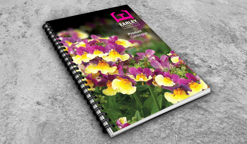
Product Catalogue
The most important selling tool in Earley's multi-channel marketing arsenal is the annual Product Brochure. It is distributed to existing stockists and used by the sales team to showcase their vast range of plants to potential new clients. When Earley decided they wanted a fresh new look and direction for the brochure, their appointed marketing company (CR Marketing) hired Inchpunch Design to bring this project to life.
A review of the previous brochure (by ourselves, the marketing team and sales directors) highlighted several issues with the design that hindered its function. The main criticisms being the inconsistent page layout and individual products being very hard to find.
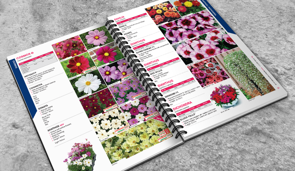
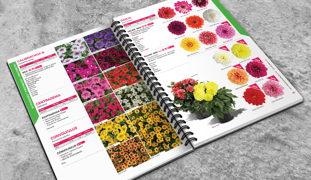
Working closely with CR Marketing we helped create a clean and structured page layout that could be implemented consistently throughout the new brochure. To make product navigation as easy as possible, each section is colour coded and product genus headings (highlighted in bold, capitalised pink text) are listed alphabetically.
Our new layout dedicates slightly more space to the flower imagery as it's these photographs that really sell the product. Each image is individually named so it can be easily referenced in the product information text.
The most important selling tool in Earley's multi-channel marketing arsenal is the annual Product Brochure. It is distributed to existing stockists and used by the sales team to showcase their vast range of plants to potential new clients. When Earley decided they wanted a fresh new look and direction for the brochure, their appointed marketing company (CR Marketing) hired Inchpunch Design to bring this project to life.
A review of the previous brochure (by ourselves, the marketing team and sales directors) highlighted several issues with the design that hindered its function. The main criticisms being the inconsistent page layout and individual products being very hard to find.
Working closely with CR Marketing we helped create a clean and structured page layout that could be implemented consistently throughout the new brochure. To make product navigation as easy as possible, each section is colour coded and product genus headings (highlighted in bold, capitalised pink text) are listed alphabetically.
Our new layout dedicates slightly more space to the flower imagery as it's these photographs that really sell the product. Each image is individually named so it can be easily referenced in the product information text.
As many Earley stockists leave the brochure on display for customers to view, the covers are printed onto a thicker stock than the inner text pages and gloss laminated. This additional protection helps minimise creasing / tearing so it has longer shelf life. The publication is spiral bound so the pages lay flat when being thumbed through.
Newsletter
As part of their on-going marketing campaign, Earley Ornamentals wanted to introduce a printed newsletter that they could distribute to existing and new customers. It's purpose is to engage with the customer and inform them of new plant ranges, colour trends, innovations etc.
After discussions with the client and marketing team regarding the ideal look of the new publication, we established that it needed to be colourful but clean, incorporate a structured page layout and convey a contemporary style. All these elements were factored in to our design solution.
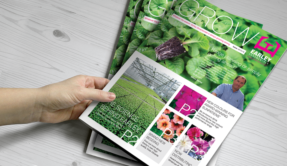
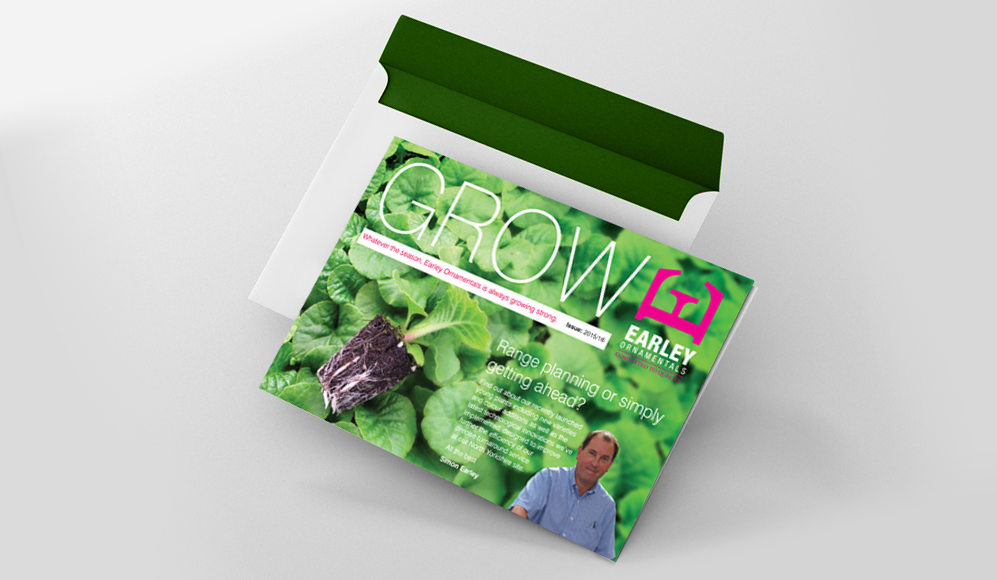
On the front cover we were keen to include a prominent forward section from owner Simon Earley. Earley Ornamentals is a family run business and we wanted to give the company a human face. His forward is also an opportunity to highlight interesting company information and any special promotions.
We visually split the front cover layout into two separate sections so the A4 portrait publication can be folded in half (A5 landscape) and both sides can be read independently. This practical and innovative design feature reduced postage costs when it came to distribution.
We visually split the front cover layout into two separate sections so the A4 portrait publication can be folded in half (A5 landscape) and both sides can be read independently. This practical and innovative design feature reduced postage costs when it came to distribution.
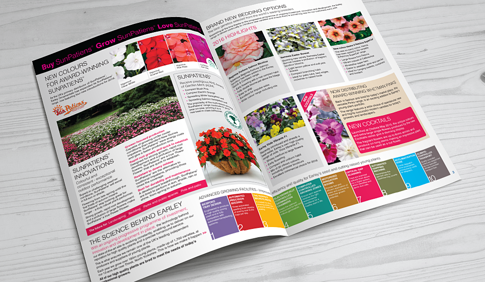
Using bold block colour, vivid product images and clever typography, the inside double page spread continues the colourful but clean look of the front cover. All the featured articles are clearly sectioned and easy to read. Though the newsletter primary purpose is to sell, it has more of a "lifestyle" quality that readers will really engage with.
The way Inchpunch handled this design project was very impressive. They took on board all our comments then went away and came back with a concept that exceeded all our expectations. They even came up with the publication name "Grow"! Nothing seemed like too much trouble and Siobhan was an absolute pleasure to work with.
All content ©Inchpunch Design Limited.