Selby Osteopaths & Wellness Clinic
Logo, Branding and Marketing Material
Client: Selby Osteopaths & Wellness Clinic
Selby Osteopaths & Wellness Clinic invited Inchpunch Design to create a fresh new identity that would symbolise and unify their individual range of health and well being services.
During our initial consultation we asked the client to sum up their range of services in one sentence. After much thought, the response was "freedom of movement and mind". Using this as the foundation for our concepts, we then explored options on how to visualise this phrase in a graphic form. After a bit of research it became clear that the butterfly was synonymous with the spirit of freedom.
As the clinic houses several individual services (all of which compliment each other), we deconstructed the butterfly shape into separate elements. When united, they create the completed finished form. The two colours blend a medical "osteopath" blue with an uplifting "wellness" teal.
Poster
As the clinic houses several individual services (all of which compliment each other), we deconstructed the butterfly shape into separate elements. When united, they create the completed finished form. The two colours blend a medical "osteopath" blue with an uplifting "wellness" teal.
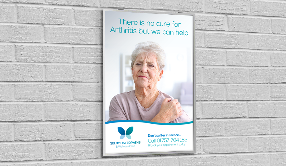
Poster
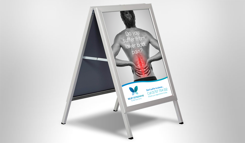
Advertising A Board